Taylor University unveiled new branding to students on Friday, Dec. 2 at the end of the chapel service.
Those who attended chapel were greeted with some initial elements of the new branding as the school celebrated its release.
Each person in attendance received a long-sleeve t-shirt with the new branding elements and a cupcake, as well as other items including stickers.
Included in the re-branding of the university was a new primary academic logo, a new color palette and a new “community theme” among other changes.
That community theme is “Life to the Full.” The new phrase is meant to be an overall story of the university and what it represents.
“(The theme) is all-encompassing,” Vice President for Enrollment and Marketing Holly Whitby said. “It’s not meant just for prospective students, it’s not just meant for our current students, it’s not just meant for our employees. It’s meant for all of us, and we want to pursue life to the full in whatever group we fall in today.”
The theme will be used throughout the university’s branding moving forward.
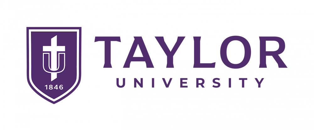
Another notable change is the primary logo for Taylor. The new design will feature a shield and a word mark. The cross and the basin, in the shape of a T and a U remain, but added is a shield and the year, “1846,” which was the year Taylor was founded.
“It will take time to replace the old logo, just like it’s taken some time to replace the old athletics logo,” Whitby said. “So coming out of the launch on Friday you’ll see stuff get replaced across campus, and you’ll also see new branding in new spots on campus.”
In addition is a change in colors, and the primary purple color used, known as “Taylor purple,” was slightly altered.
“We looked at a lot of different purples,” Whitby said. “And we think the shield makes the logo stronger and that this is a stronger logo to represent Taylor.”
Some changes had already taken place this year, as seen by the new logo of Taylor Athletics that was unveiled before the beginning of the fall semester, as the new Turner Stadium turf was unveiled with the new logo. In addition, the center court logo in Odle Arena was altered last week to reflect the new athletics logo.
The process for the logo change involved gathering data and opinion from upwards of 100 people through a variety of methods, including focus groups and workshops.