On Aug. 15, 2022, Taylor University released a new athletic logo, resulting from a brand study conducted over the past year.
“It is important that our imagery matches our personality. And that is the goal of this brand study, to articulate the personality of Taylor University and present that to the world,” Vice President of Enrollment and Marketing Holly Whitby said.
As Taylor looks forward to the next stage of development, the Athletic Department wanted a new look and face for the future.
Taylor University's marketing department and the athletic department worked together closely to ensure a smooth transition.
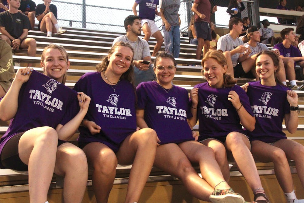
While the university's previous logo appeared to be a group of shapes blocked together to form a trojan helmet, the new logo shows a more detailed trojan head that seems to be charging into battle.
“I think there is a sense of strength in the new logo,” said Associate Director of Intercollegiate Athletics Natalie Young.
Making sure the logo includes everyone was also something the university wanted to make sure they got correct.
A lot of thought and effort went into making the new logo inclusive for everyone that represents Taylor University as it accomplishes this with small details such as the mix between being detailed and not detailed in the face.
“We obviously wanted to represent the entire department really well, and that includes men and women and also includes people of different ethnic backgrounds. So we want to make sure it was very inclusive,” Young said.
The department felt that they are moving in the right direction with the new logo and are happy to move on from the previous one.
While the university changed the appearance of the trojan, they never considered changing to another mascot.
“We changed the look of the trojan to better represent our brand,” Whitby said. “But we never considered changing from the trojan.”
While the marketing team and athletic department worked together on the project, the change was an all-campus decision.
Many different groups of people helped to make the logo change happen, including Student Development, Advancement, the Admissions Office and the President’s Office.
“We have a large group of representatives from across campus involved. So athletics didn’t make the decision by themselves. It was a campus-wide decision,” Whitby said.
The group that worked on the initial change stretched across all of campus, but there was a group of about 15 people who helped drive the project from the inside, Young said.
The biggest help was ultimately the teamwork between the Marketing and Athletic departments with added support from different areas across campus.
“There'll be additional things coming out from the brand study as we get into the fall and further into the year,” Whitby said.
Another difference made in the athletic department was the removal of the color gold from the athletic mark.
However, gold will still be seen around campus, as it was only removed from the athletic department’s mark and not the entire university.
“We’ve had our struggles with the consistency of getting things printed in gold and done in gold and for the sake of having something very uniform, we felt that gray or silver was a good option for the athletic side,” Young said.
While the logo has changed, it will be at least a few years before the uniforms of the student-athletes change, so some of the gold will last a while longer before it is removed.
The advantages of the new logo are that it is very flexible, Young said.
“Doing a three-color mark, you can take that guy and just drop him on the surface and he doesn’t change,” Young said.
Not only is the new logo more detailed, its sense of direction has meaning behind it.
“It has a determined spirit, a spirit of moving forward,” Whitby said.
Taylor University has come together to make something it hopes will become the new face of the university.
“Perhaps the most profound takeaway from this process has been that there’s clear consensus on, ‘What makes Taylor, Taylor,’” the university’s website reads.